
|
Book Covers One of the first suggestions Kira Henschel, owner of Henschel Haus Publishing, made when we signed our contract was to re-imagine my book covers. I confess my skill set doesn’t include book covers and how I think about a book cover is not the norm. For my first book, Murphy’s Troubles, I worked with graphic artists to select and alter an image. My idea was to portray the destruction to buildings that was a large part of the IRA bombing campaign. The graphic artist found an image that fit my idea and then we altered color and other technical aspects of the image. We chose a Celtic font because I thought it added authenticity. For the second book I wanted the book cover to portray a central theme of the book – the peace walls in Belfast. I found a free image and then had second graphic artists alter it to fit the dimensions of the book cover. I was delighted with the image. For my third book in the series my idea, once again, was to have the book cover reflect the theme of the book. Searching the web I found a free image of an old nautical map with a compass and quill pen. Again, I thought it was the perfect cover. Do you notice the pattern here? To this date I have wanted each book cover to reflect the theme of the novel. The book titles also reflect the theme of the novels. I thought this approach was reasonable. A publisher thinks differently. Kira Henschel called saying it was time to work on new book covers, she asked me what the overarching theme as for all three books. I answered – redemption, atonement, contrition. “No- no she said – something physical, you know Ireland.” I told her I would have to think about it and shoot her an email later. Initially, I wanted a geographic scene of Ireland on each cover until I realized most people couldn’t tell the difference between scenes from Ireland versus Pennsylvania unless it was dramatic like the Cliffs of Mohr. I mulled over what to add to the geographic scene that would show readers the topic was Ireland. Simple – a symbol all would recognize as Irish, for example, the Celtic cross, an Irish Knot, or the Tree of Knowledge. With a quick Google search I found free images of all of them and sent them off to Kira Henschel in an email. She was pleased that I understood her concept of making all three books “look” alike. Having a publisher opens up my world as an author and gives me a new perspective. 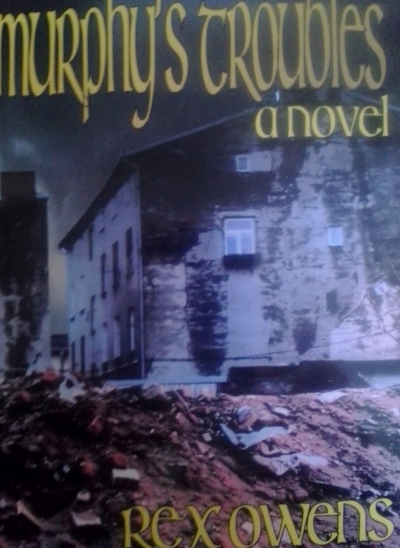
2 Comments
1/26/2018 08:02:43 am
I digested the above with much interest and do agree book cover design needs a lot of deep thought. When I published my Memoir : MY GENTLE WAR, my youngest son designed the cover showing an iconic photograph of St. Paul's in the blitz and a smaller image of me in dance costume in one corner. Over the years, unique/attractive covers have often seduced me into buying/reading many books...Covers and back blurb have a lot of power, quite separate to whoever wrote the book itself!.Brisk sales with yours, sir! 3/26/2018 05:07:36 am
I wanted each book cover to reflect the theme of the novel and this was the demand of the author. The book titles also reflect also theme of the novels. So this is a best blog. Leave a Reply. |

rex owensI write to tell the story of our human saga. Categories
All
Archives
May 2021
|
 RSS Feed

|

|

|

|